
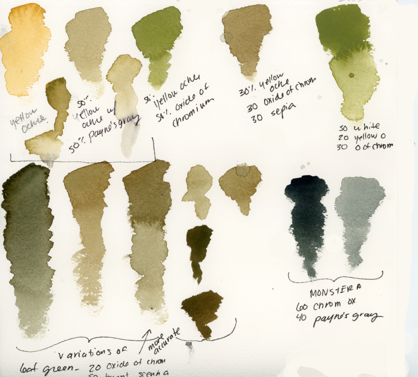
The magic of Earth Colors
In the world of color theory and design, natural colors refer to a much softer and more subdued palette. Natural colors tend to be muted, earthy, and reminiscent of things found in nature like stones, trees, animals, and soil. A muted color means not so vivid. One can accomplish this by adding white for a pastel look or black/brown (Paynes Gray or Sepia) for a darker moody feel. My personal favorite is adding a touch of Sepia to any color to make an earthy hue.
These natural colors are known to be soothing, having a calming effect and are easier on the eyes compared to bright saturated colors. Natural palettes have longevity and don’t go out of style quickly. The muted colors also tend to pair well together and with other colors, patterns, textures you may have in your space.
©Copyright. All rights reserved.
We need your consent to load the translations
We use a third-party service to translate the website content that may collect data about your activity. Please review the details in the privacy policy and accept the service to view the translations.